
Designing for Scale, Trust, and a Growing Client Base
After six years and six prior iterations, the COPE CORRALES website had become an evolving reflection of the firm’s rapid growth. As a premier private wealth advisory firm, their client base had grown significantly—and so had their digital needs. With user data, behavioral analytics, and real feedback from real clients, we had a goldmine of insight. It was time for the next evolution: one that could scale with their momentum and elevate their already-trusted digital presence.
As the principal product designer
I led the seventh iteration of their site—owning the experience end to end from UX research to visual design, all while collaborating with marketing and development to ensure execution stayed sharp and on-brand.
What we were facing wasn’t a broken site—it was a successful platform that needed refinement. But growth had introduced new friction points:
- Design elements were beginning to feel dated as the brand matured
- Content clarity needed tightening to support a broader range of users
- User flows weren’t keeping pace with changing client expectations
- Mobile experience was under-optimized for an increasingly mobile-first audience
With the trust already built, our focus was on sharpening the experience
making it smoother, clearer, and more aligned with where the firm was headed.
Phase 1: Research & Insight
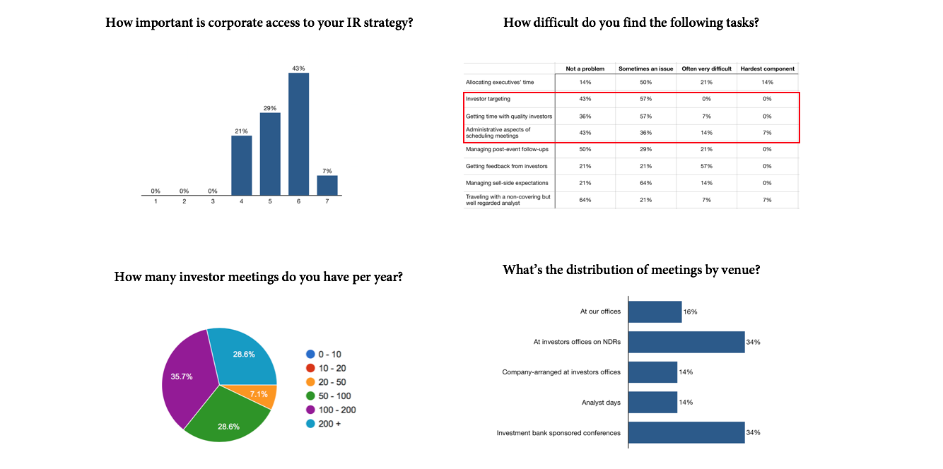
Over years of iteration, we’d collected a rich body of user data—session recordings, surveys, and client feedback. This gave us a clear picture of what was working and what was holding people back.
To deepen that understanding, I conducted:
- Stakeholder interviews to align with the firm’s evolving vision
- User surveys to hear from clients navigating the platform today
- Competitive analysis of elite financial services sites to stay ahead of design and UX trends
Phase 2: Strategic Realignment
With the insights in hand, we clarified our mission:
Make the website feel as elevated as the service behind it.
That meant an overhaul of the information architecture—refining navigation, consolidating pathways, and elevating the storytelling so users could understand value faster and take action more confidently.
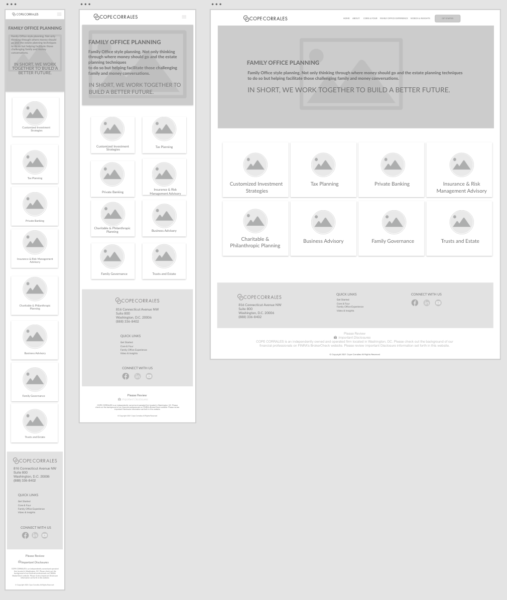
Phase 3: Wireframing for Efficiency
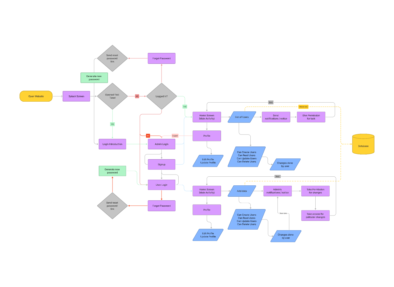
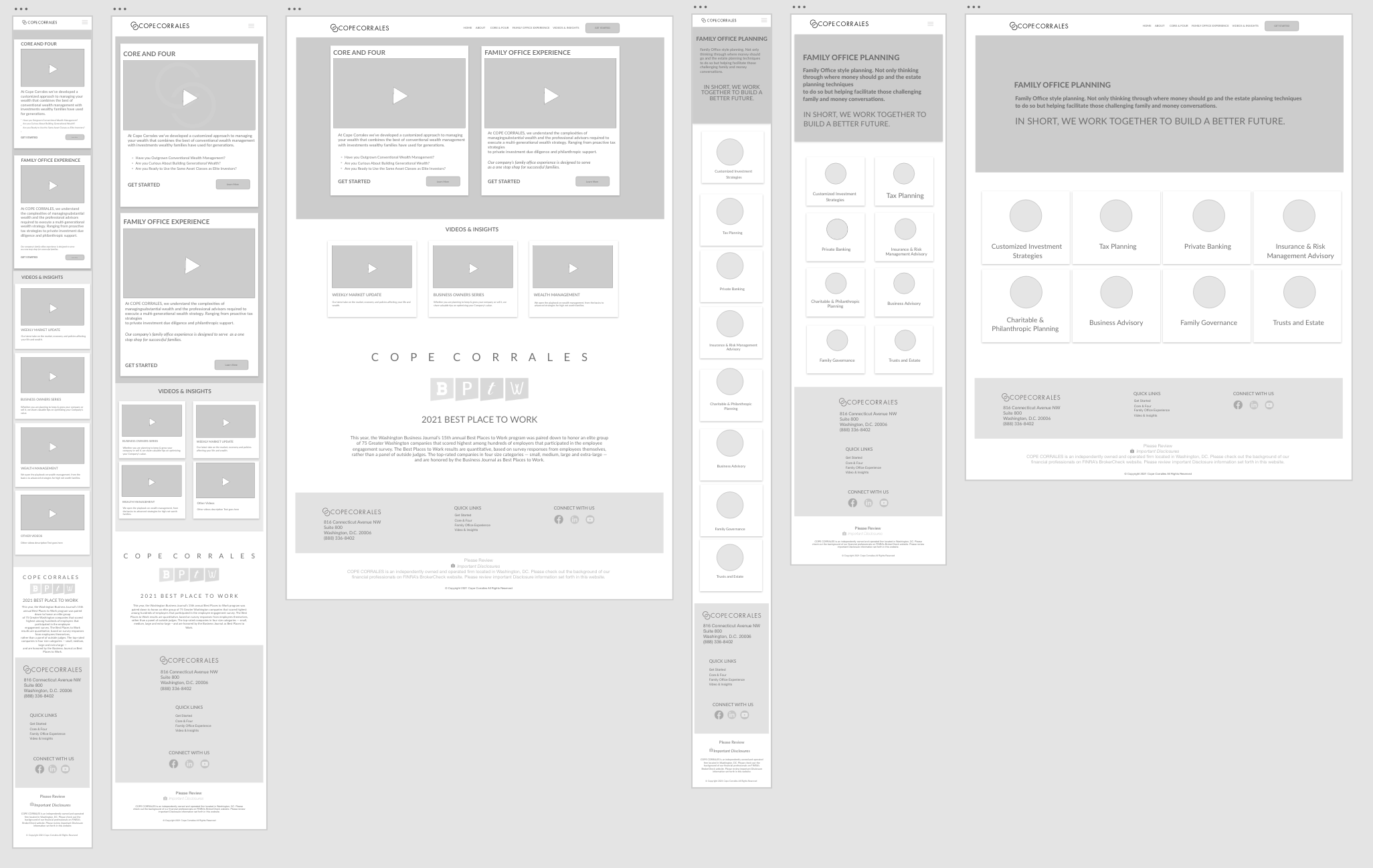
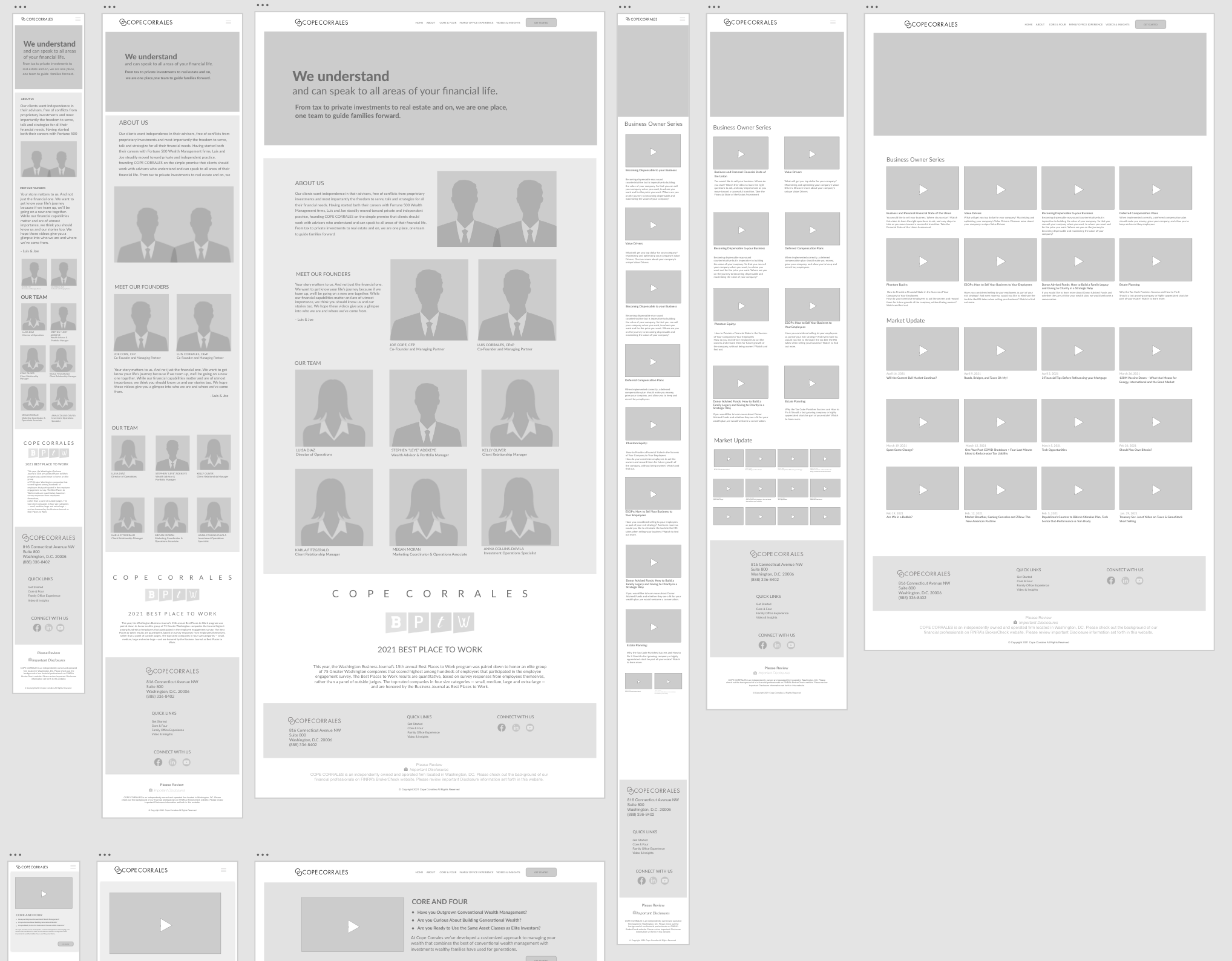
I mapped key user journeys with a focus on these primary goals:
- Understand the firm’s capabilities
- Feel trust through authority and clarity
- Easily reach out or book a consultation
We tested multiple wireframe flows, using feedback loops to trim unnecessary steps and highlight critical moments.
Phase 4: Elevating the Design
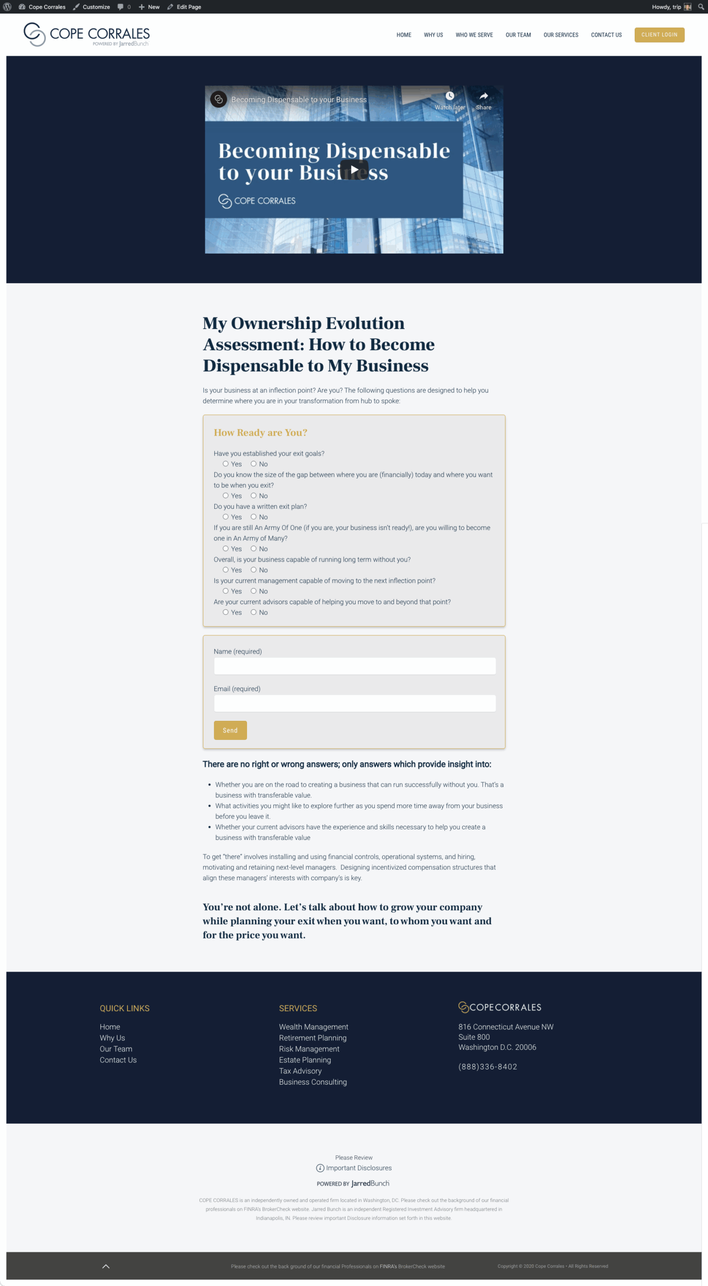
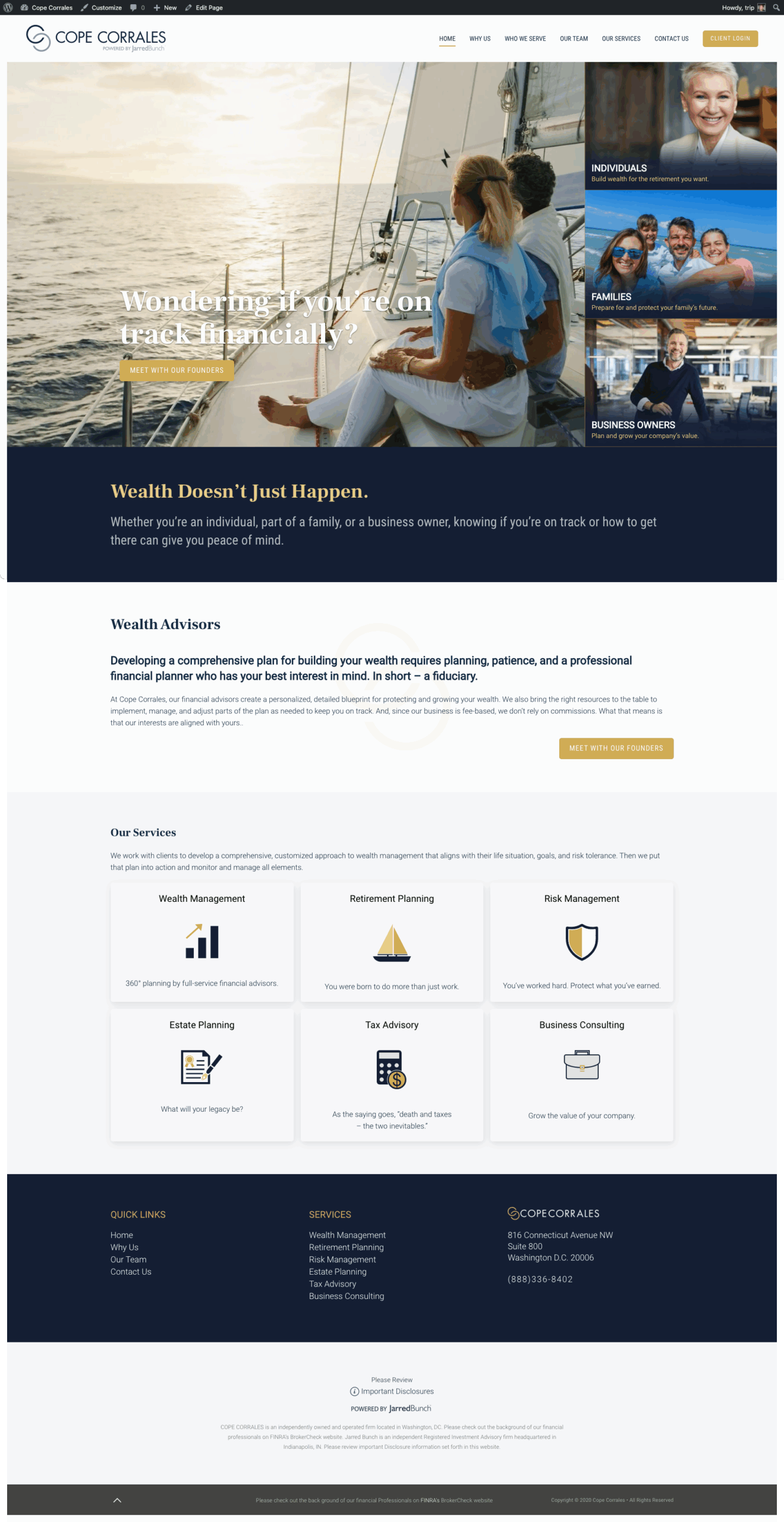
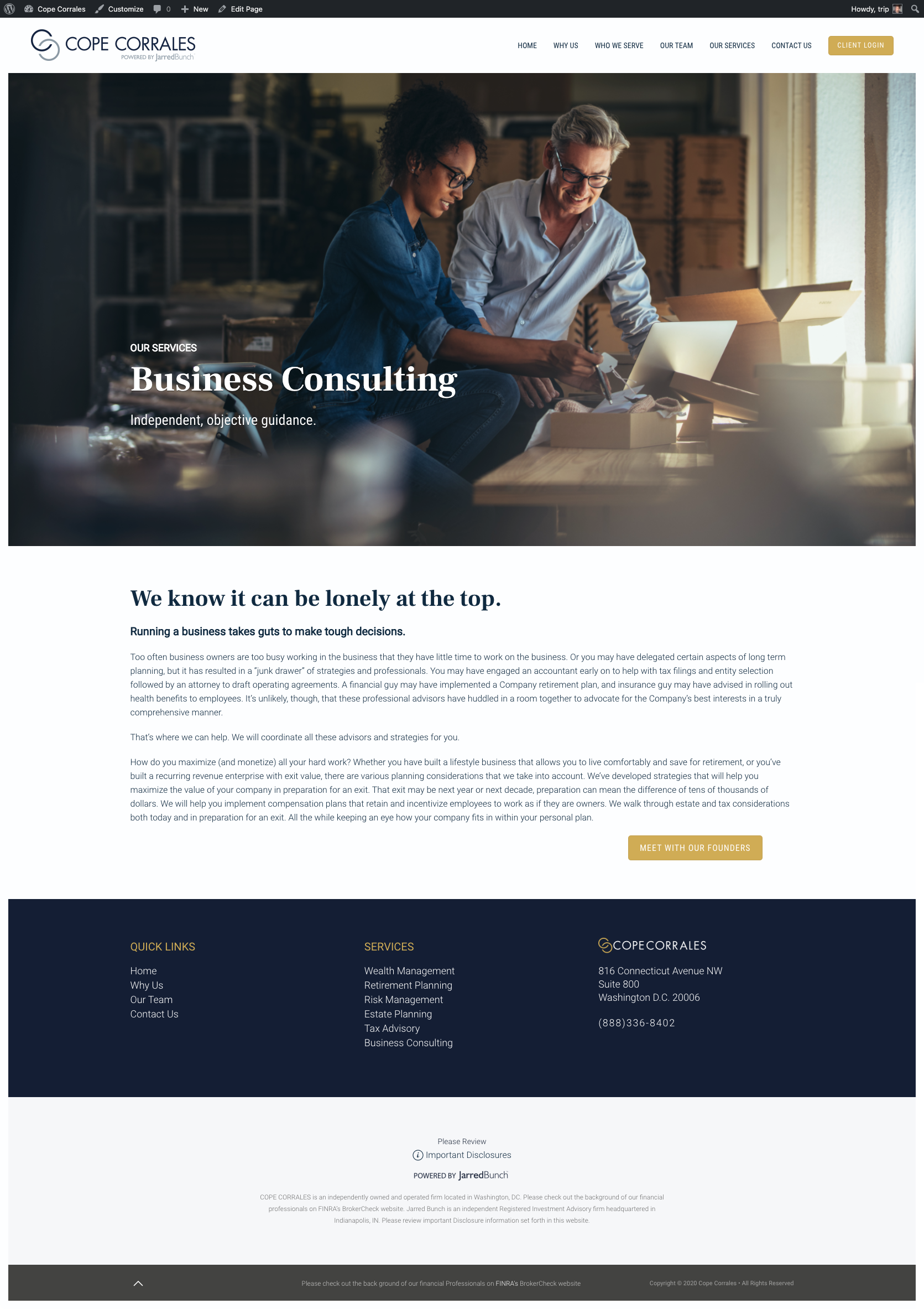
The visual design evolved to match the firm’s prestige:
- A muted, premium color palette
- Elegant type pairing to signal trust and sophistication
- Consistent use of imagery that communicated clarity, success, and confidence
I also introduced microinteractions—subtle animations and hover states—that helped guide users intuitively without overwhelming them.
On the content side, we refreshed copy across key pages, placing emphasis on clarity, authority, and action.
Phase 5: Prototype & Test
With high-fidelity prototypes ready, we ran usability testing with both long-term clients and new users. Their feedback helped us fine-tune key interactions, especially around navigation and mobile performance.
We ran A/B tests on CTAs, form placement, and language—leveraging live data for decisions, not assumptions.
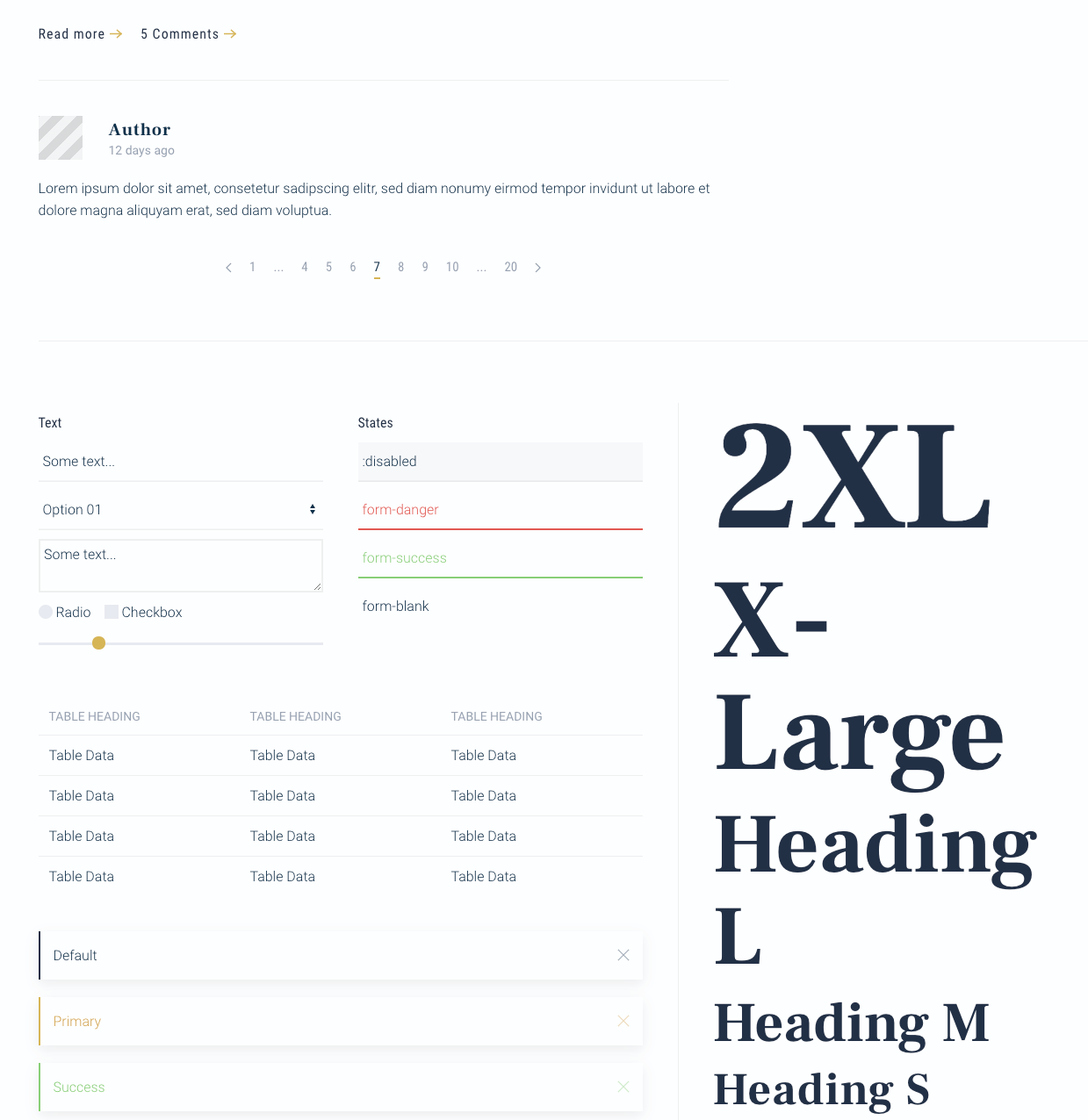
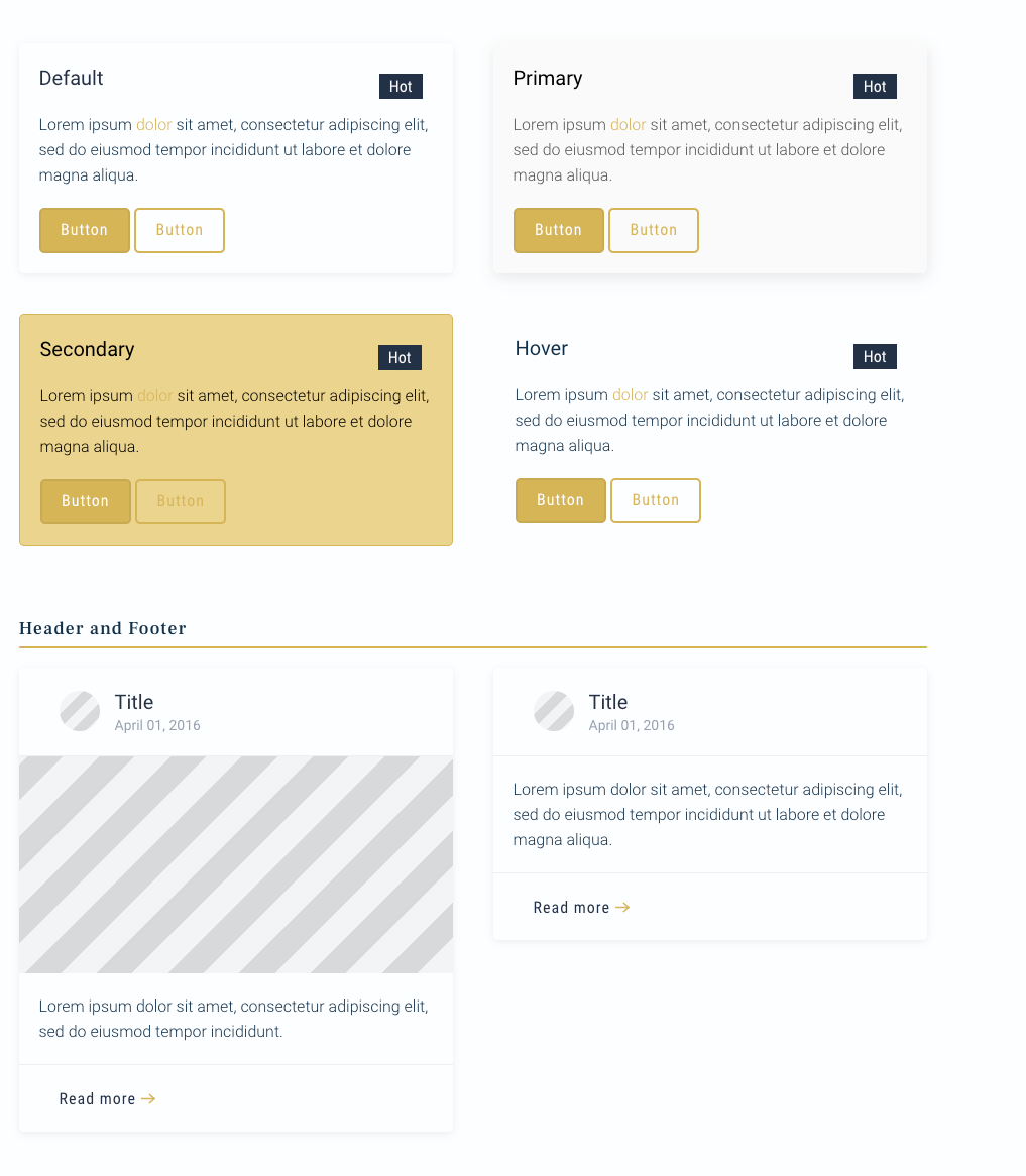
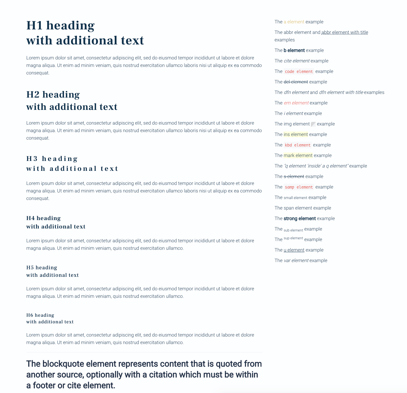
UI Blocks
Phase 6: Finalization & Delivery
Once approved, the final design was fully spec’d for development, with a mobile-first mindset embedded from the start. I worked closely with the engineering team to ensure flawless implementation and supported a smooth handoff with clear documentation and a responsive design system.
The Results
- Increase in lead form submissions 40%
- Boost in average session time 55%
- improvement in mobile usability 70%
- Clients reported a significantly more professional and intuitive experience 100%
Key Takeaways
- Designing at Scale Means Listening: Long-term user data is your most powerful asset—use it to evolve with confidence.
- Precision Over Reinvention: Not every redesign needs to start over. This one succeeded because we sharpened what already worked.
- Refinement Builds Trust: For high-value clients, every detail matters—and every detail communicates something.
Work
Unified Marketing Dashboard From Chaos to Clarity
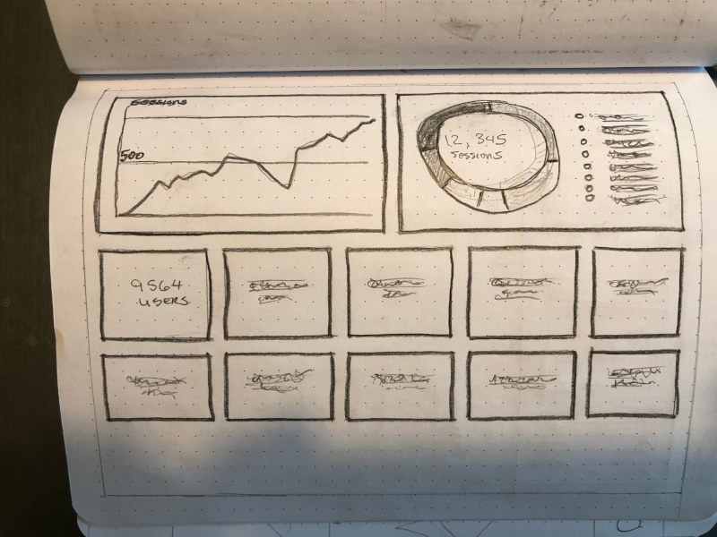
TripleE Fusion was juggling marketing data across platforms like Google Ads, call tracking soft-ware, SEO tools, Facebook Ads, reviews, and website analytics.
Empowering Designers, Streamlining Development
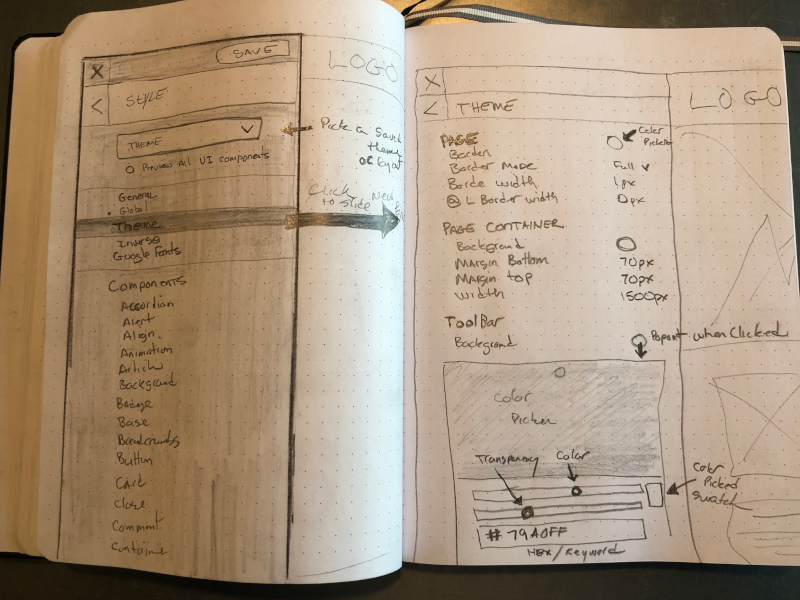
The goal: build a lightweight, fast, and intuitive website builder that lets designers create stunning websites—no coding required.